Back to the Wall - Katharina Grosse at Galerie Max Hetzler
Part 1:
This exhibit was my introduction to Katharina Grosse. I navigated through the luxuriously installed show at Galerie Max Hetzler in Berlin, having no preconception about Grosse or her work or her work history. So, I saw this show with fresh eyes and an open mind.
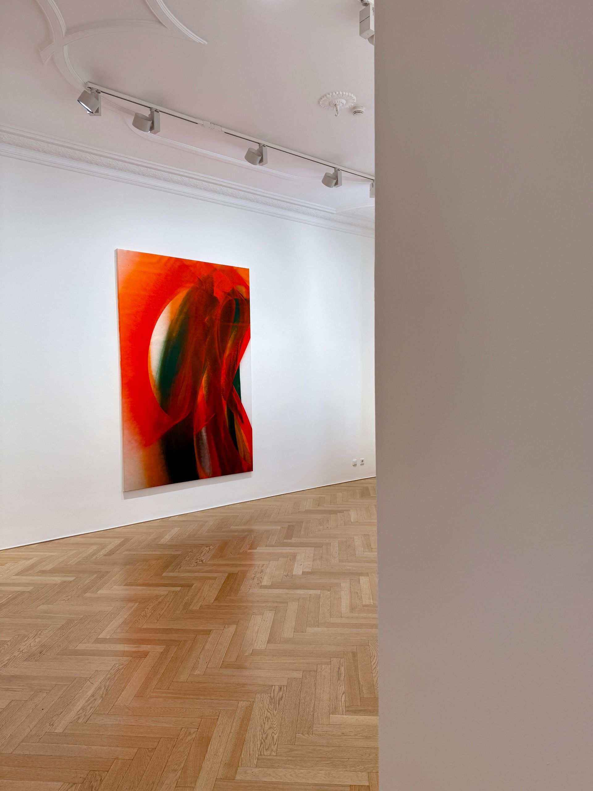
I described the installation as luxurious, because two of the gallery rooms had only one painting, and the other two rooms had only three each. But these paintings require a lot of breathing space.
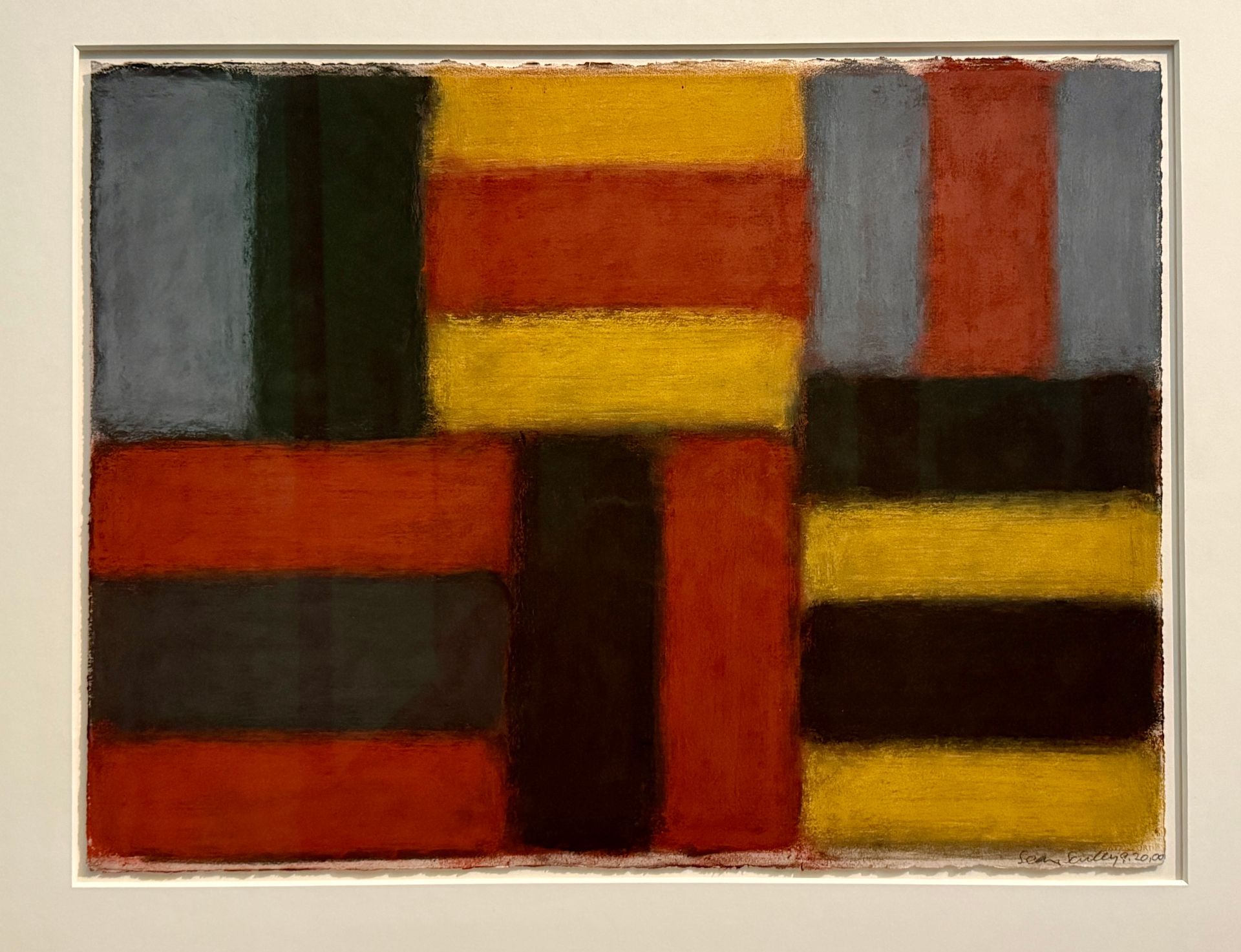
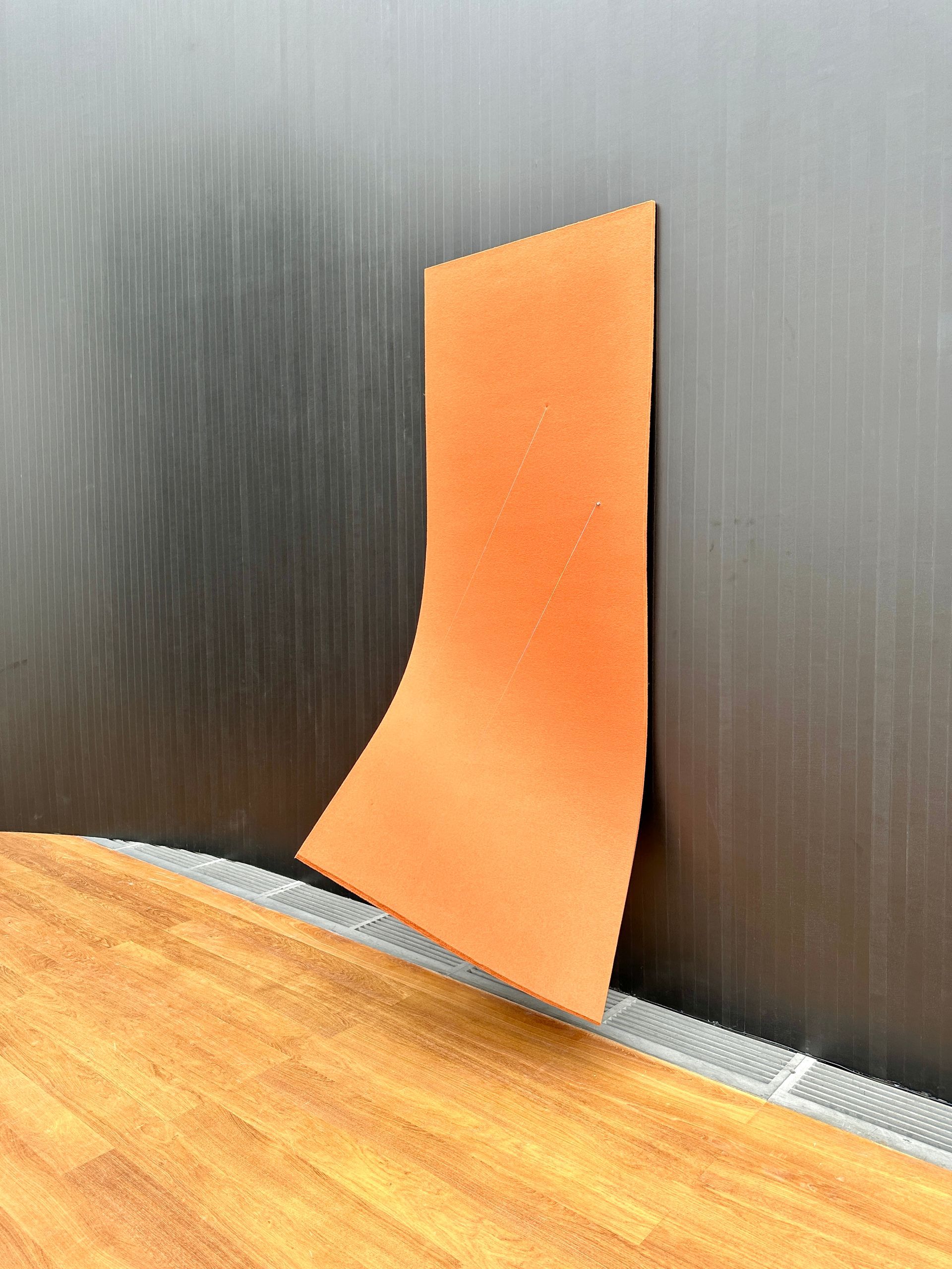
This show, titled, “ High Noon Lumen,” consists of eight large, vertical canvases, essentially all the same size (around 8’ x 5’).
This kind of painting is not easy to pull off: large bands of bright color can go south quickly and come off as decorative space fillers. However, these paintings do not go there, and I took them seriously - either because I wanted to or because they really were serious (read on). There are often two sides to how we can approach art: 1) It’s kind of nothing. or 2) It’s really something (and because it’s something, I’m lingering and paying attention to what’s going on here).
Part 2 :
After researching Katharina Grosse’s long-standing and very successful art career and after viewing images of her work history, AND after letting the show percolate in my mind for a day - here are additional comments:
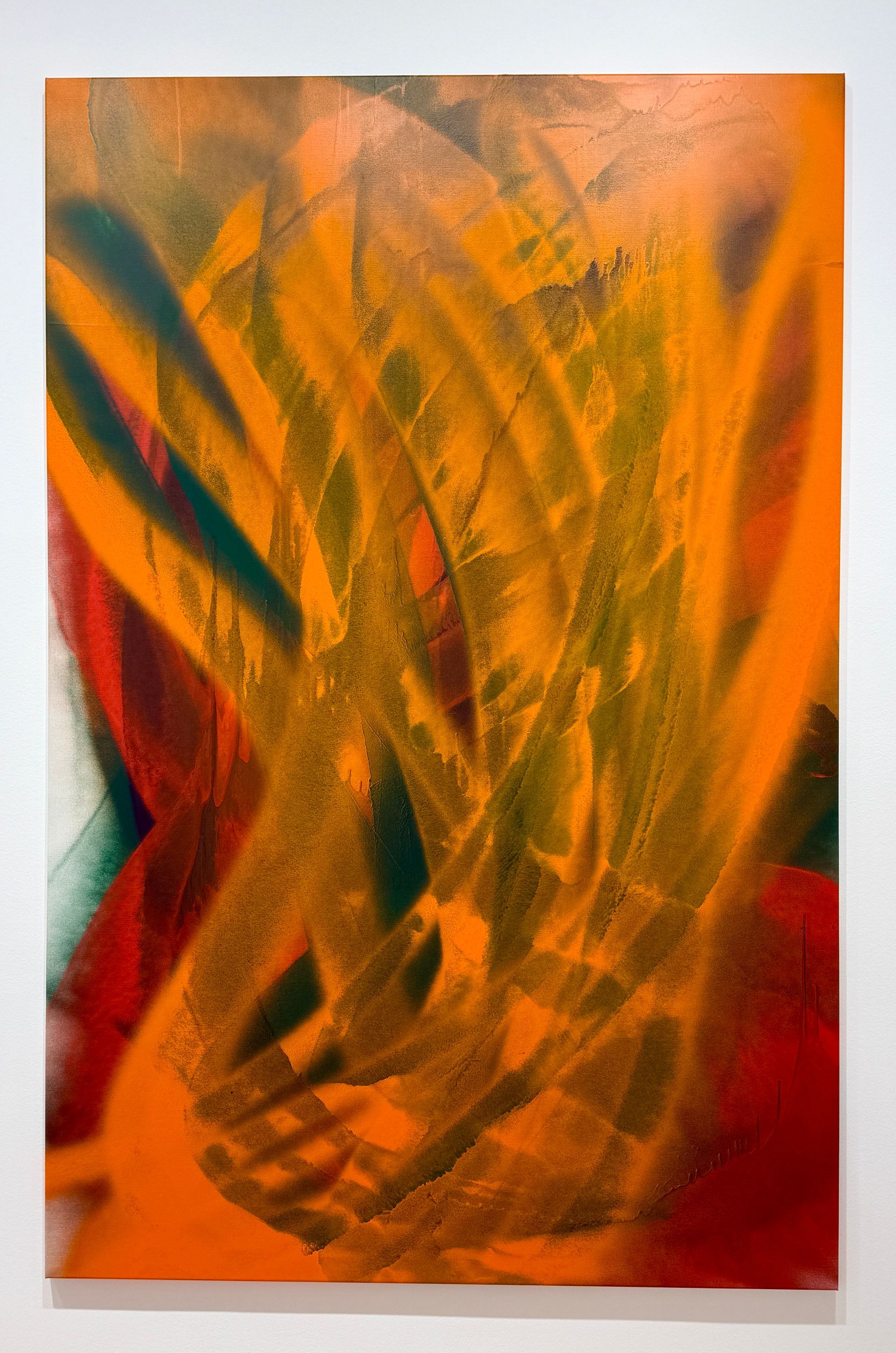
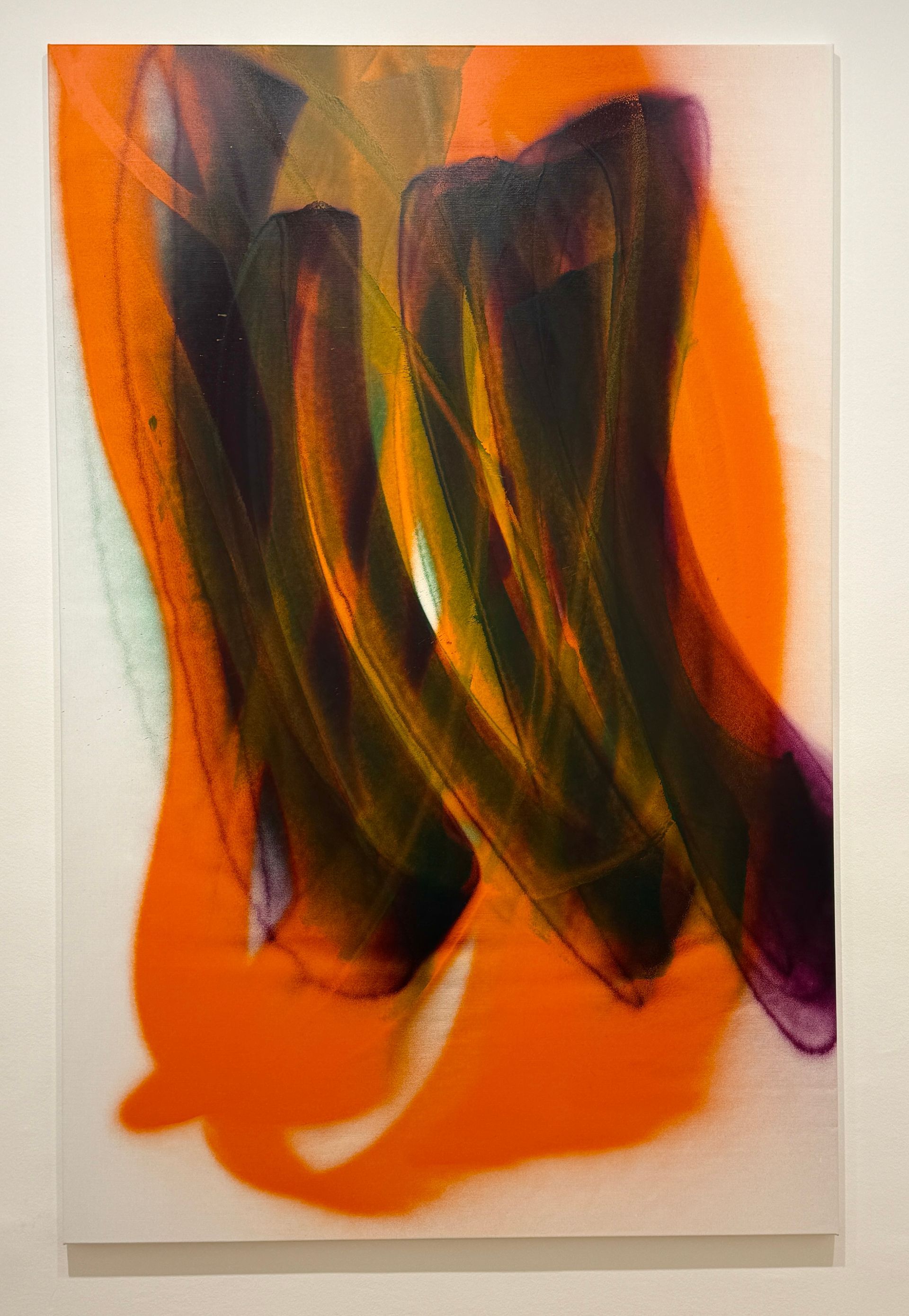
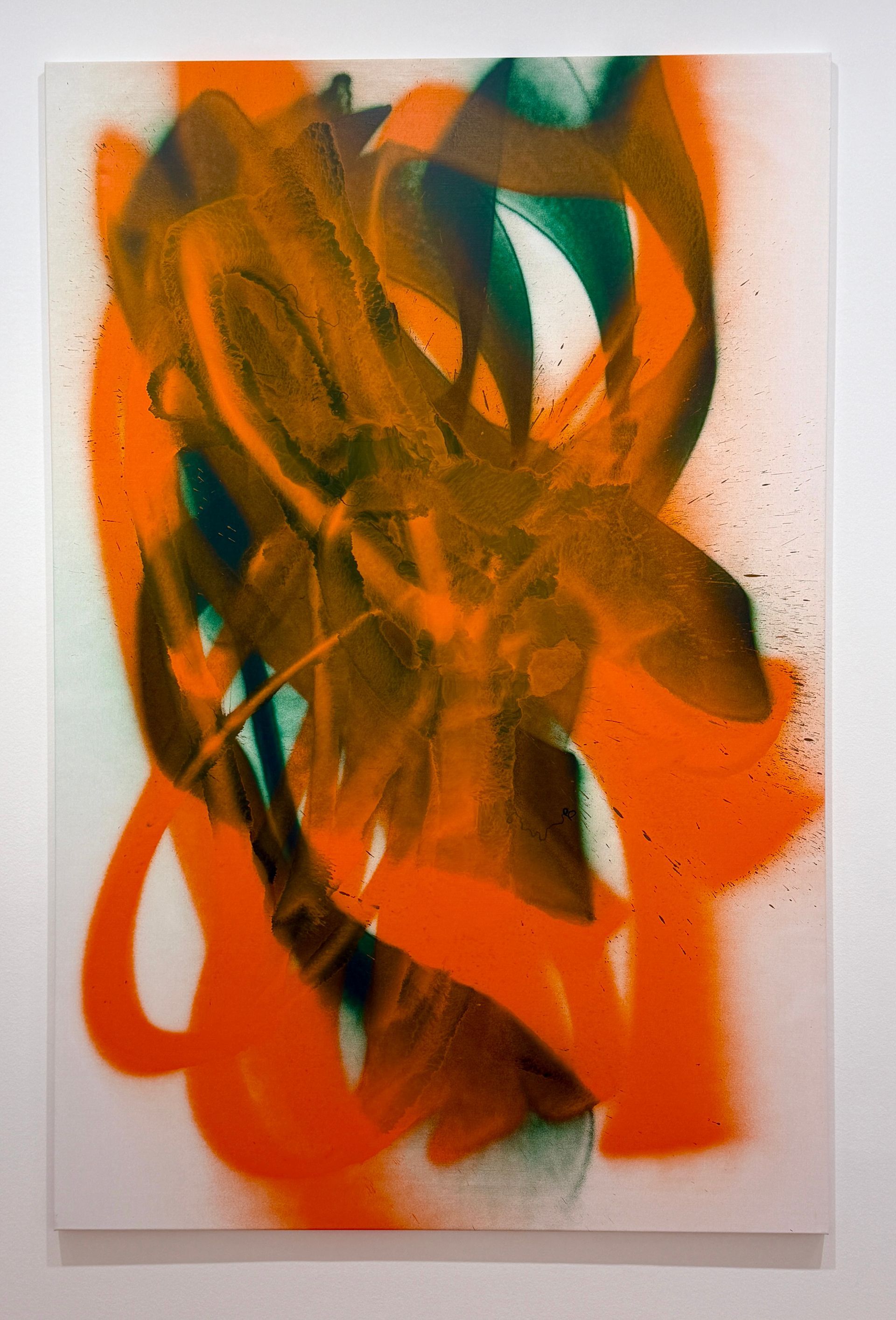
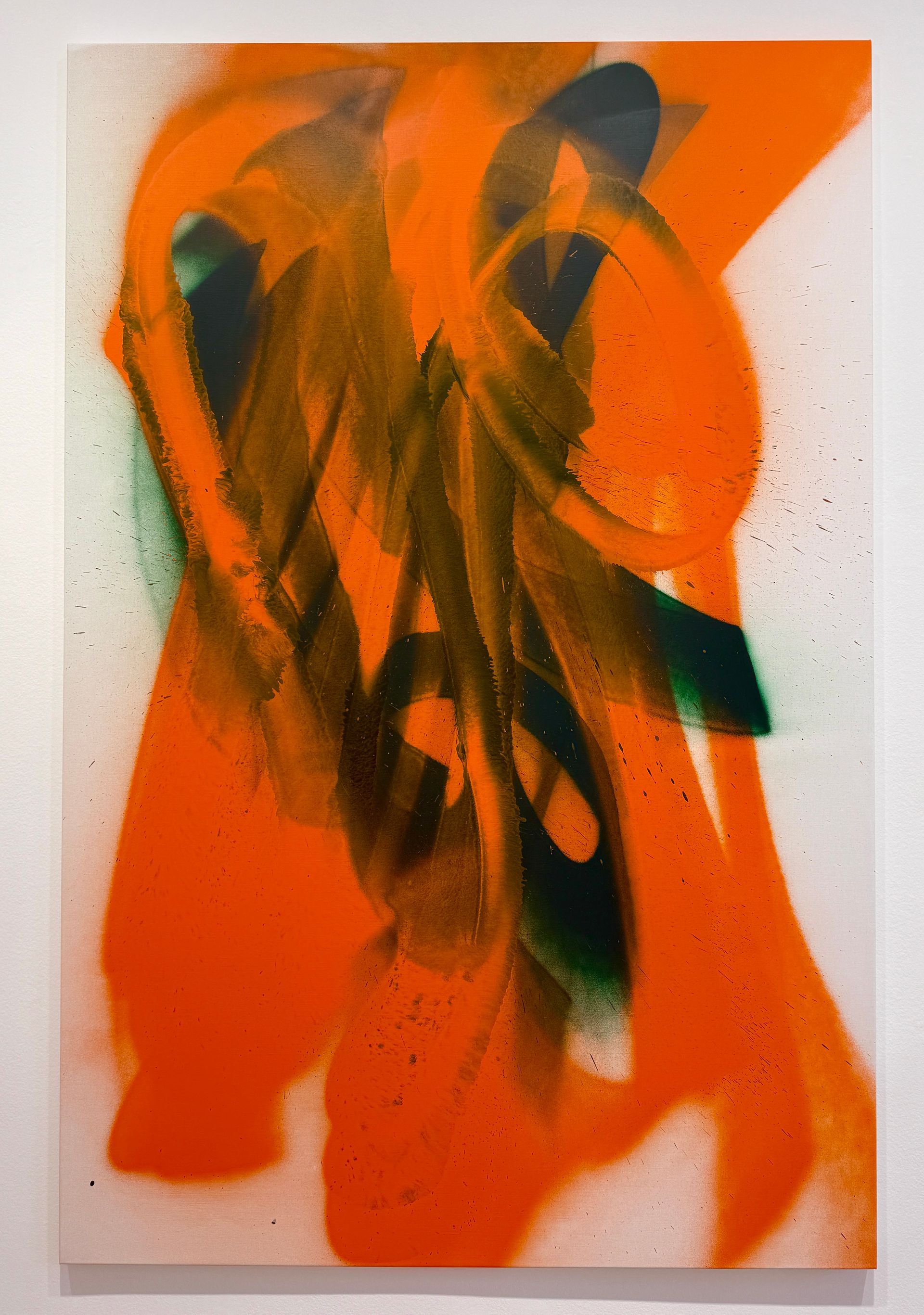
Problem: Create a series of large, abstract vertical paintings, with sweeping gestural arm movements, and limit the colors to … wait for it … orange and green. Give those parameters to Katharina Grosse, inventive artist and educator, and what happens is “High Noon Lumen,” showing at Galerie Max Hetzler through November 1, 2025. Grosse’s artistic goal has been to free painting from its traditional place on the wall, allowing paint to invade whole environments, such as fields, beaches, architecture, as well as her bedroom (including her bed and clothing).
“High Noon Lumen,” brings her art back to the wall.
Even though the paintings in this series are hemmed in by the rectangular canvas, they don’t feel confined. Color areas are cropped at the edges of the canvas, implying that there is more happening than what we see. The paintings are not so much orange and green, as they are orange vs. green, which creates a useful tension. The orange is the “winner,” but the green holds its own. The orange feels closer to the viewer with the green threatening to move forward or eventually overtake the visual space. Grosse’s greens are convincing. To my mind, green is the most difficult color for a painter to successfully use. Very often green can be formulaic and fall flat. To see good greens, look at Cézanne.
Grosse’s paintings are very warm - they attract with their fireside glow; however, the heat of the canvases signal the viewer to keep a safe distance. The gestural movements of the sprayed-on paint create a human scale to the paintings.
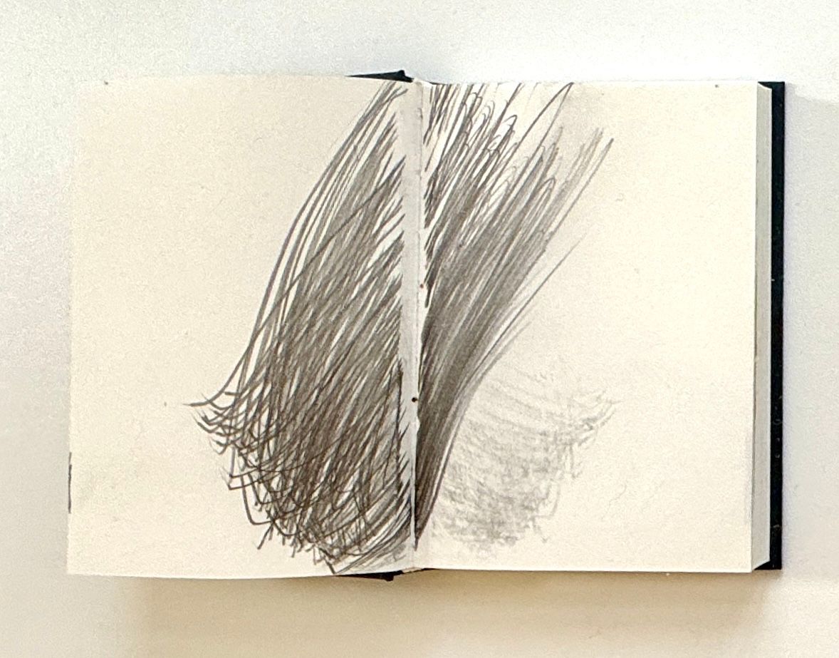
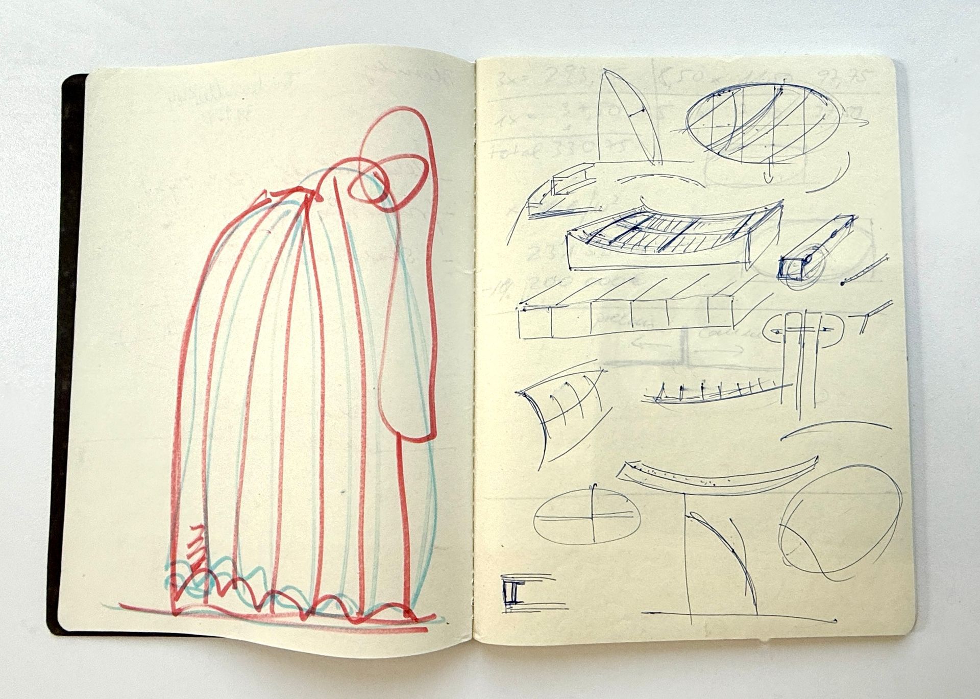
In addition to the eight paintings in the show, a selection of Grosse’s sketchbooks are on view. They show variety of fresh visual ideas. I could see how each of those little drawings could serve as a launching pad for a series of paintings!